An Analysis on Brexit

Aim: to understand the background of voters that took place in the Brexit Referandum in 2016. (Language: R)
We will first have a look at the results of the 2016 Brexit vote in the UK.
The data comes from Elliott Morris, who cleaned it and made it available through his DataCamp class on analysing election and polling data in R.
Our main outcome variable (or y) is leave_share, which is the percent of votes cast in favour of Brexit, or leaving the EU. Each row is a UK parliament constituency.
To get a sense of the spread, or distribution, of the data, we can plot a histogram, a density plot, and the empirical cumulative distribution function of the leave % in all constituencies.
Loading and taking a quick look at the data
brexit_results <- read_csv(here::here("data", "brexit_results.csv"))## Rows: 632 Columns: 11## ── Column specification ────────────────────────────────────────────────────────
## Delimiter: ","
## chr (1): Seat
## dbl (10): con_2015, lab_2015, ld_2015, ukip_2015, leave_share, born_in_uk, m...##
## ℹ Use `spec()` to retrieve the full column specification for this data.
## ℹ Specify the column types or set `show_col_types = FALSE` to quiet this message.glimpse(brexit_results)## Rows: 632
## Columns: 11
## $ Seat <chr> "Aldershot", "Aldridge-Brownhills", "Altrincham and Sale W…
## $ con_2015 <dbl> 50.592, 52.050, 52.994, 43.979, 60.788, 22.418, 52.454, 22…
## $ lab_2015 <dbl> 18.333, 22.369, 26.686, 34.781, 11.197, 41.022, 18.441, 49…
## $ ld_2015 <dbl> 8.824, 3.367, 8.383, 2.975, 7.192, 14.828, 5.984, 2.423, 1…
## $ ukip_2015 <dbl> 17.867, 19.624, 8.011, 15.887, 14.438, 21.409, 18.821, 21.…
## $ leave_share <dbl> 57.89777, 67.79635, 38.58780, 65.29912, 49.70111, 70.47289…
## $ born_in_uk <dbl> 83.10464, 96.12207, 90.48566, 97.30437, 93.33793, 96.96214…
## $ male <dbl> 49.89896, 48.92951, 48.90621, 49.21657, 48.00189, 49.17185…
## $ unemployed <dbl> 3.637000, 4.553607, 3.039963, 4.261173, 2.468100, 4.742731…
## $ degree <dbl> 13.870661, 9.974114, 28.600135, 9.336294, 18.775591, 6.085…
## $ age_18to24 <dbl> 9.406093, 7.325850, 6.437453, 7.747801, 5.734730, 8.209863…head(brexit_results) #displaying the first five rows of the data## # A tibble: 6 × 11
## Seat con_2015 lab_2015 ld_2015 ukip_2015 leave_share born_in_uk male
## <chr> <dbl> <dbl> <dbl> <dbl> <dbl> <dbl> <dbl>
## 1 Aldershot 50.6 18.3 8.82 17.9 57.9 83.1 49.9
## 2 Aldridge-Bro… 52.0 22.4 3.37 19.6 67.8 96.1 48.9
## 3 Altrincham a… 53.0 26.7 8.38 8.01 38.6 90.5 48.9
## 4 Amber Valley 44.0 34.8 2.98 15.9 65.3 97.3 49.2
## 5 Arundel and … 60.8 11.2 7.19 14.4 49.7 93.3 48.0
## 6 Ashfield 22.4 41.0 14.8 21.4 70.5 97.0 49.2
## # … with 3 more variables: unemployed <dbl>, degree <dbl>, age_18to24 <dbl>Data Exploration
# histogram
histogram <- ggplot(brexit_results, aes(x = leave_share)) +
  geom_histogram(binwidth = 2.5)  +
   labs(title = "Histogram Plot of Leave Share",
        subtitle = "Leave Share: Percent of votes in cast in favour of Brexit",
       x = "Leave Share",
       y = "Count ") +
   NULL
histogram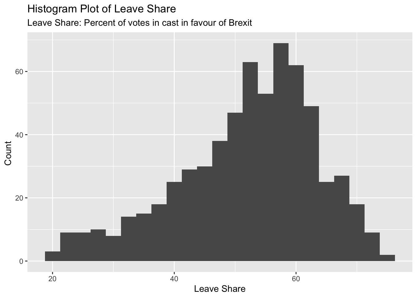
# density plot
density_plot <- ggplot(brexit_results, aes(x = leave_share)) +
  geom_density()

density_plot2 <- density_plot +
   labs(title = "Cumulative Density Distribution Plot of Leave Share",
        subtitle = "Leave Share: Percent of votes in cast in favour of Brexit",
       x = "Leave Share ",
       y = "Density ") +
   NULL
density_plot2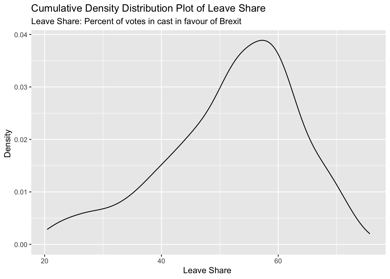
# The empirical cumulative distribution function (ECDF)
ecdf <- ggplot(brexit_results, aes(x = leave_share)) +
  stat_ecdf(geom = "step", pad = FALSE) +
  scale_y_continuous(labels = scales::percent)

ecdf2 <- ecdf +
  labs(title= "Empirical Cumulative Distribution Function of Leave Share",
       x = "Leave Share: Percent of votes in cast in favour of Brexit",
       y= "Cumulative Probability ") +
  NULL
ecdf2 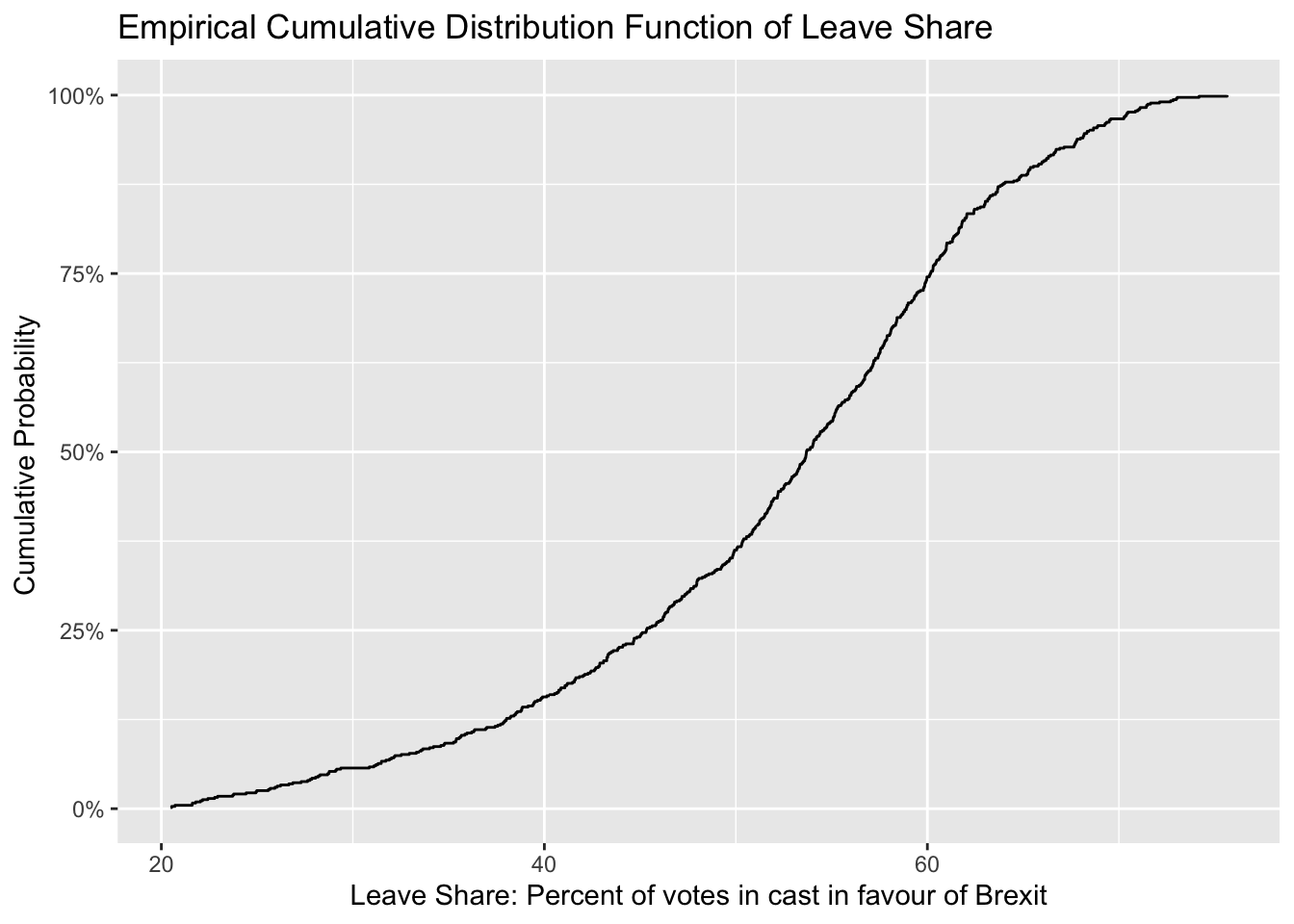
One common explanation for the Brexit outcome was fear of immigration and opposition to the EU’s more open border policy. We can check the relationship (or correlation) between the proportion of native born residents (born_in_uk) in a constituency and its leave_share.
brexit_results %>%
  select(leave_share, born_in_uk) %>%
  cor()
## leave_share born_in_uk
## leave_share 1.0000000 0.4934295
## born_in_uk 0.4934295 1.0000000The correlation is almost 0.5, which shows that the two variables are positively correlated.
We can also create a scatterplot between these two variables using geom_point. We also add the best fit line, using geom_smooth(method = "lm").
immigrationPlot <- ggplot(brexit_results, aes(x = born_in_uk, y = leave_share)) +
  geom_point(alpha=0.3) +

  # add a smoothing line, and use method="lm" to get the best straight-line
  geom_smooth(method = "lm") +

  # use a white background and frame the plot with a black box
  theme_bw() +
  labs(title="Scatter Plot of Leave Share vs Born UK",
       subtitle= "Born UK: Percentage of voters that were born in the UK",
       x = "Leave Share ",
       y ="Born in UK ")

immigrationPlot
## `geom_smooth()` using formula 'y ~ x'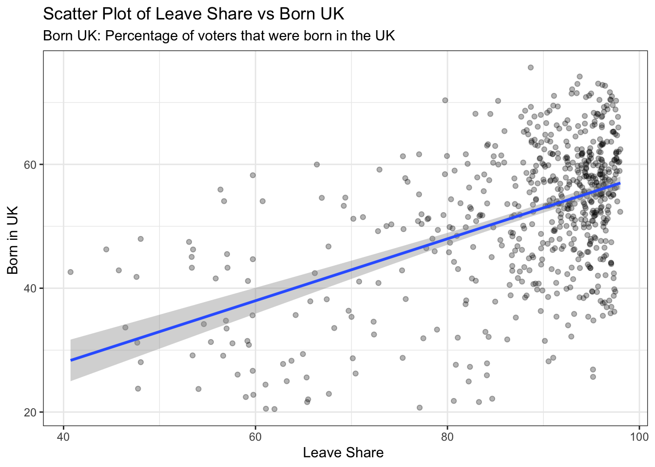
What does this scatter plot tell us?
First of all, the histogram of the leave share is slightly left skewed, which means that voters more likely to vote in favour of leaving the EU.
The 0.5 correlation between the leave share and born in the UK, shows that there is a positive correlation between the percentage of pro-Brexit voters and percentage of UK born voters. According to the scatter plot of Leave Share vs Born UK, we also can see that there is an obvious positive trend between Born in UK and Leave Share. This makes sense since, people who do not support immigration are more likely to be UK born and bred people rather than immigrants.
The upper left side of the graph is almost empty. This emptiness is kind of expected since that area represents UK born and bred majority whose leave share is relatively low. While the upper right area is fully crowded, in those area the born in the UK percentage is relatively higher while the leave share is also higher, which represents the general trend in the country.
Political Affiliation and Leave_Share Graph:
As part of the final part of the analysis, it would be interesting to analyse the relationship between the political affiliation of the voters and whether they voted in favour of Brexit or not.
brexit <- brexit_results %>%

select(c("con_2015", "lab_2015", "ld_2015", "ukip_2015", "leave_share"))

names(brexit) <- c("Conservative" ,"Labour", "Lib_Dems", "UKIP", "Leave_Share")


long_brexit <- pivot_longer(brexit, c("Conservative" ,"Labour", "Lib_Dems", "UKIP"), names_to="party")

ggplot(long_brexit, aes(x = value, y = Leave_Share, color=party ) ) +
  geom_smooth(size=0.7, method = "lm" ) +
  geom_point(size=0.7, alpha = 0.3) +
  labs( title = "How political affiliation translated to Brexit voting",
          x = "Party % in the UK 2015 general election",
          y = "Leave % in the UK 2016 Brexit referendum") +
  theme_light() +
  theme(legend.position = "bottom",
        legend.title = element_blank(),
        plot.title = element_text(face = "bold", size = rel(1)),
        axis.title = element_text(size = rel(0.8)))+
  scale_colour_manual(labels =  c("Conservative" ,"Labour", "Lib Dems", "UKIP", "Leave Share") ,
                      values = c("#0087DC","#E4003B", "#FAA61A", "#EFE600"))
## `geom_smooth()` using formula 'y ~ x'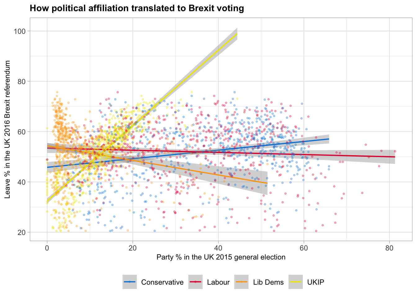
What does this mean though?
It is fair to claim that the voters that support conservative political parties are more likely to have voted to leave EU, which makes sense. Since conservative British people are worried about the immigration inflow and they wanted to opted out of EU in order to prevent the freedom of movement from countries in the EU that they see not as high status.