Gapminder Analysis

gapminder country comparison
Aim: to analyse the data analyst’s favourite data set: gapminder. This is my first serious R coding.
The famous gapminder dataset has data on life expectancy, population, and GDP per capita for 142 countries from 1952 to 2007.
glimpse(gapminder) ## Rows: 1,704
## Columns: 6
## $ country <fct> "Afghanistan", "Afghanistan", "Afghanistan", "Afghanistan", …
## $ continent <fct> Asia, Asia, Asia, Asia, Asia, Asia, Asia, Asia, Asia, Asia, …
## $ year <int> 1952, 1957, 1962, 1967, 1972, 1977, 1982, 1987, 1992, 1997, …
## $ lifeExp <dbl> 28.801, 30.332, 31.997, 34.020, 36.088, 38.438, 39.854, 40.8…
## $ pop <int> 8425333, 9240934, 10267083, 11537966, 13079460, 14880372, 12…
## $ gdpPercap <dbl> 779.4453, 820.8530, 853.1007, 836.1971, 739.9811, 786.1134, …head(gapminder, 20) # look at the first 20 rows of the dataframe## # A tibble: 20 × 6
## country continent year lifeExp pop gdpPercap
## <fct> <fct> <int> <dbl> <int> <dbl>
## 1 Afghanistan Asia 1952 28.8 8425333 779.
## 2 Afghanistan Asia 1957 30.3 9240934 821.
## 3 Afghanistan Asia 1962 32.0 10267083 853.
## 4 Afghanistan Asia 1967 34.0 11537966 836.
## 5 Afghanistan Asia 1972 36.1 13079460 740.
## 6 Afghanistan Asia 1977 38.4 14880372 786.
## 7 Afghanistan Asia 1982 39.9 12881816 978.
## 8 Afghanistan Asia 1987 40.8 13867957 852.
## 9 Afghanistan Asia 1992 41.7 16317921 649.
## 10 Afghanistan Asia 1997 41.8 22227415 635.
## 11 Afghanistan Asia 2002 42.1 25268405 727.
## 12 Afghanistan Asia 2007 43.8 31889923 975.
## 13 Albania Europe 1952 55.2 1282697 1601.
## 14 Albania Europe 1957 59.3 1476505 1942.
## 15 Albania Europe 1962 64.8 1728137 2313.
## 16 Albania Europe 1967 66.2 1984060 2760.
## 17 Albania Europe 1972 67.7 2263554 3313.
## 18 Albania Europe 1977 68.9 2509048 3533.
## 19 Albania Europe 1982 70.4 2780097 3631.
## 20 Albania Europe 1987 72 3075321 3739.How did life expectancy has changed over the years for the country and the continent I come from?
country_data <- gapminder %>%
            filter(country == "Turkey")

head(country_data)
## # A tibble: 6 × 6
## country continent year lifeExp pop gdpPercap
## <fct> <fct> <int> <dbl> <int> <dbl>
## 1 Turkey Europe 1952 43.6 22235677 1969.
## 2 Turkey Europe 1957 48.1 25670939 2219.
## 3 Turkey Europe 1962 52.1 29788695 2323.
## 4 Turkey Europe 1967 54.3 33411317 2826.
## 5 Turkey Europe 1972 57.0 37492953 3451.
## 6 Turkey Europe 1977 59.5 42404033 4269.continent_data <- gapminder %>%
filter(continent == "Europe") #Turkey is registered under Europe before 2007
head(continent_data)## # A tibble: 6 × 6
## country continent year lifeExp pop gdpPercap
## <fct> <fct> <int> <dbl> <int> <dbl>
## 1 Albania Europe 1952 55.2 1282697 1601.
## 2 Albania Europe 1957 59.3 1476505 1942.
## 3 Albania Europe 1962 64.8 1728137 2313.
## 4 Albania Europe 1967 66.2 1984060 2760.
## 5 Albania Europe 1972 67.7 2263554 3313.
## 6 Albania Europe 1977 68.9 2509048 3533.plot1 <- ggplot(data = country_data , mapping = aes(x = year, y = lifeExp))+
geom_point() +
geom_smooth(se = FALSE)+
NULL
plot1## `geom_smooth()` using method = 'loess' and formula 'y ~ x'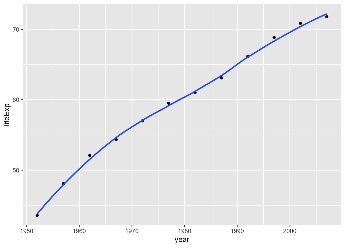
 plot1<- plot1 +
   labs(title = " Life Expactancy Over Time in Turkey ",
       x = " Year ",
       y = " Life Expectancy ") +
   NULL


 plot1
## `geom_smooth()` using method = 'loess' and formula 'y ~ x'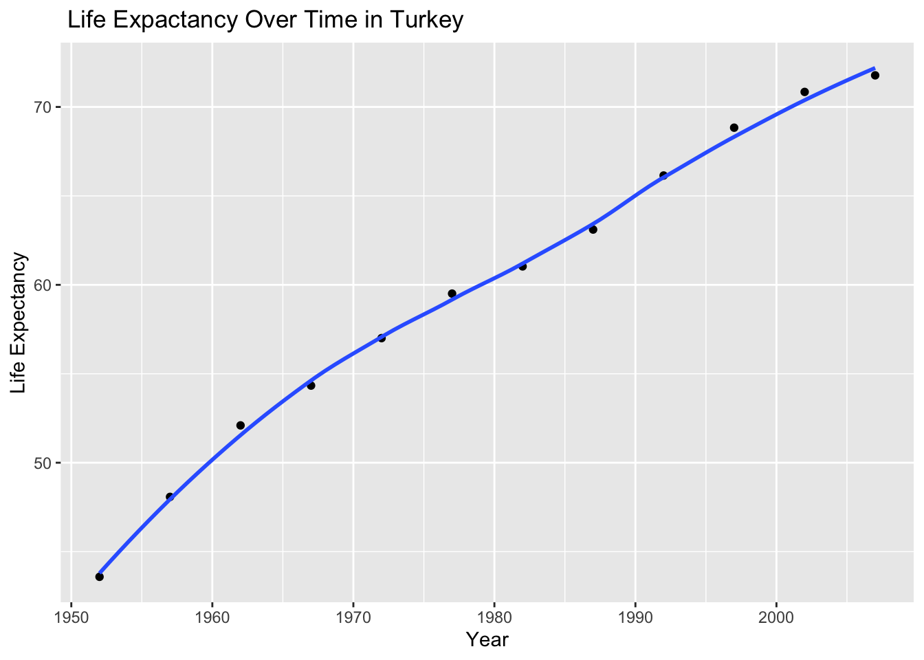
Producing a plot for all countries in the continent I come from.
 ggplot(continent_data, mapping = aes(x = year , y = lifeExp , colour = country, group = country)) +
   geom_point() +
   geom_smooth(se = FALSE) +
   NULL
## `geom_smooth()` using method = 'loess' and formula 'y ~ x'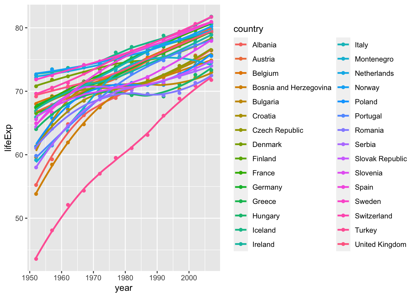
Producing a life expectancy over time graph, grouped by continent.
 ggplot(gapminder , mapping = aes(x = year , y = lifeExp, colour = continent))+
   geom_point() +
   geom_smooth(se = FALSE) +
   facet_wrap(~continent) +
   theme(legend.position="none") + #remove all legends
   NULL
## `geom_smooth()` using method = 'loess' and formula 'y ~ x'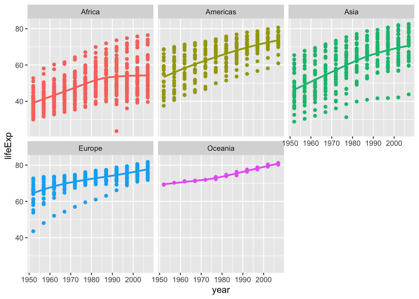
##Conclusions
Type your answer after this blockquote.
A positive life expectency trend is evident in all continents
First of all, generally speaking, for every, the life expectancy over years has been demonstrating a positive trend. This positive trend in life expectancy can be tied to the developments in medicine, biomedical engineering and technology in the world.
Africa’s stagnation after the 1990s
Africa’s graph is especially interesting since the life expectancy starts of with an average of 40 years of age, increases to 50 and shows a stagnation after 1990. Further research can be conducted to understand what happened in 1990, or how the resources have been negatively affected. As far as I know and after doing a very little confirmation research, Europe and Americas had been contributing to Africa’s well being by performing concerts and help packages before the 1990s and they had stopped doing so after the 90s. This might be one of the reasons and should be further investigated.
Increase in longevity from 1950s to 2007
Oceania is the continent with the highest longevity. Oceania starts off well with an average of 70 years of age and its average longevity is almost 80 or a bit more. Since there are not many countries in Oceania, its graph is fairly uniform and does not consist of many different data points. Europe is following Ocenia in longevity, starting off with 65 and increasing up to 80 years of age. Americas is the third in the longevity trend ranking, followed by Asia and Africa. The reason for the difference among the longevity between continents might be related to the overall GDP for each continent as well as the advances in medicine and technology.
The average approximated increase in each continent from 1950 to 2007 is as follows:
- Africa: 40 to 54 -> increase by ~14
- Americas: 54 to 74 -> increase by ~20
- Asia 47 to 70 -> increase by ~23
- Europe 63 to 77 -> increased by ~14
- Oceania: 70 to 80 -> increased by ~10
Approximately, Asia and Americas are the continents that showed the most significant increase in longevity from the 1950s to 2007 compared to the other continents. This makes sense since the world have been witnessing a technology and production boom from the Americas and Asia for a very long time.
About the variations in each continent
Europe’s dataset is the one that caught my eye initially. There is not a very significant variance among the different European countries. But there seems to be an outlier country in the graph, and not surprisingly it is my country Turkey. It has been always debated whether Turkey belongs to Europe or Asia. Since this data set has been relatively not so new, it is recorded in Europe, as it was the case during my childhood before all the political unrest that started with the new government: aka Geopolitics. Since Turkey’s resources and the GDP are not as high as the other European countries, Turkey’s data points stick out. If the data recorders had kept recording data after the 2010s, Turkey would have been probably moved to Asia. And it might fit in well with the high variance of longevity in Asian countries. -Or we should all give up and create a Euroasia factor in the continent feature and add Turkey and Russia there. :-) -
Asia shows the highest variance among all the continents, since the GDP is not as uniform throughout the Asian countries unlike the European countries. Americans and Africas also show a high variance since there are many different countries with varying GDPs and technologies advancements in Africa, Americas and Asia.