Where Do People Drink The Most Beer, Wine And Spirits?
Aim: To understand the alcohol consumption distribution among countries. (Language: R)
Back in 2014, fivethiryeight.com published an article on alchohol consumption in different countries. The data drinks is available as part of the fivethirtyeight package.
library(fivethirtyeight)
data(drinks)


# or download directly
# alcohol_direct <- read_csv("https://raw.githubusercontent.com/fivethirtyeight/data/master/alcohol-consumption/drinks.csv")
Analysing the variable types and missing values through the skim function.
skimr::skim(drinks)| Name | drinks |
| Number of rows | 193 |
| Number of columns | 5 |
| _______________________ | |
| Column type frequency: | |
| character | 1 |
| numeric | 4 |
| ________________________ | |
| Group variables | None |
Variable type: character
| skim_variable | n_missing | complete_rate | min | max | empty | n_unique | whitespace |
|---|---|---|---|---|---|---|---|
| country | 0 | 1 | 3 | 28 | 0 | 193 | 0 |
Variable type: numeric
| skim_variable | n_missing | complete_rate | mean | sd | p0 | p25 | p50 | p75 | p100 | hist |
|---|---|---|---|---|---|---|---|---|---|---|
| beer_servings | 0 | 1 | 106.16 | 101.14 | 0 | 20.0 | 76.0 | 188.0 | 376.0 | ▇▃▂▂▁ |
| spirit_servings | 0 | 1 | 80.99 | 88.28 | 0 | 4.0 | 56.0 | 128.0 | 438.0 | ▇▃▂▁▁ |
| wine_servings | 0 | 1 | 49.45 | 79.70 | 0 | 1.0 | 8.0 | 59.0 | 370.0 | ▇▁▁▁▁ |
| total_litres_of_pure_alcohol | 0 | 1 | 4.72 | 3.77 | 0 | 1.3 | 4.2 | 7.2 | 14.4 | ▇▃▅▃▁ |
alcohol_data <- drinksThe variable types are character and numeric. There are no missing values. There are 4 numeric and 1 character type variable.
A plot that shows the top 25 beer consuming countries
top25_beer <- drinks %>%
  slice_max(., order_by = beer_servings, n = 25)


ggplot(top25_beer,aes(y = reorder(country, beer_servings), x = beer_servings))+
  geom_col()+
  labs(x = "Beer Servings",
       y = "Country",
       title = "Top 25 Beer Consuming Countries")+
  theme_bw()+
  NULL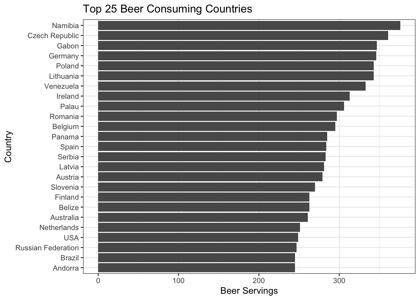
A plot that shows the top 25 wine consuming countries
# YOUR CODE GOES HERE

top25_wine<- drinks %>%
  slice_max(.,order_by = wine_servings,n=25)

ggplot(top25_wine, aes(y = reorder(country, wine_servings), x = wine_servings ))+
  geom_col()+
  labs(x = "Wine Servings",
       y = "Country",
       title = "Top 25 Wine Consuming Countries")+
  theme_bw()+
  NULL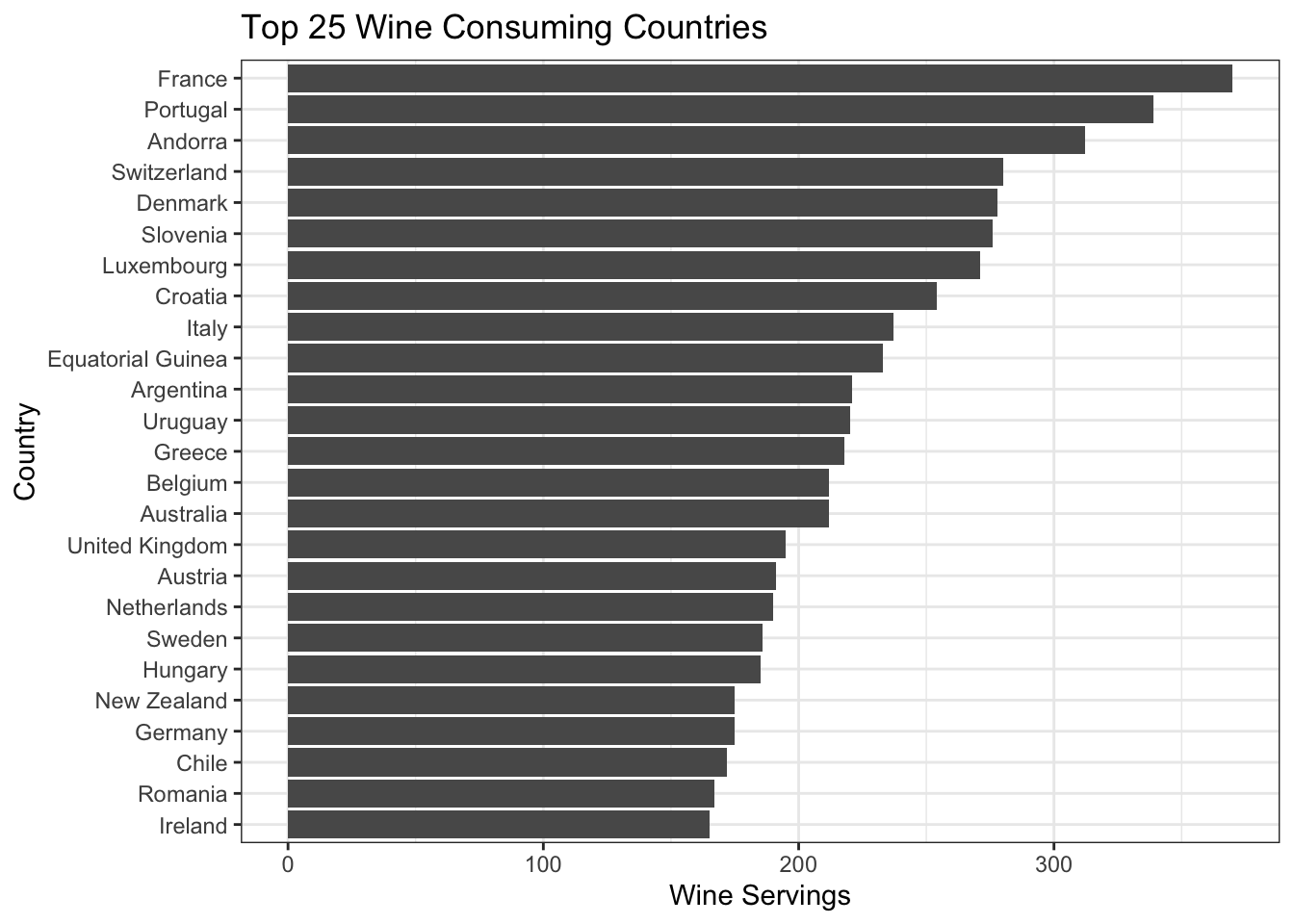
A plot that shows the top 25 spirit consuming countries
# YOUR CODE GOES HERE

top25_spirit<- drinks %>%
  slice_max(.,order_by = spirit_servings, n=25)

ggplot(top25_spirit, aes(y = reorder(country, spirit_servings), x = spirit_servings ))+
  geom_col()+
  labs(x = "Spirit Servings",
       y = "Country",
       title = "Top 25 Spirit Consuming Countries")+
  theme_bw()+
  NULL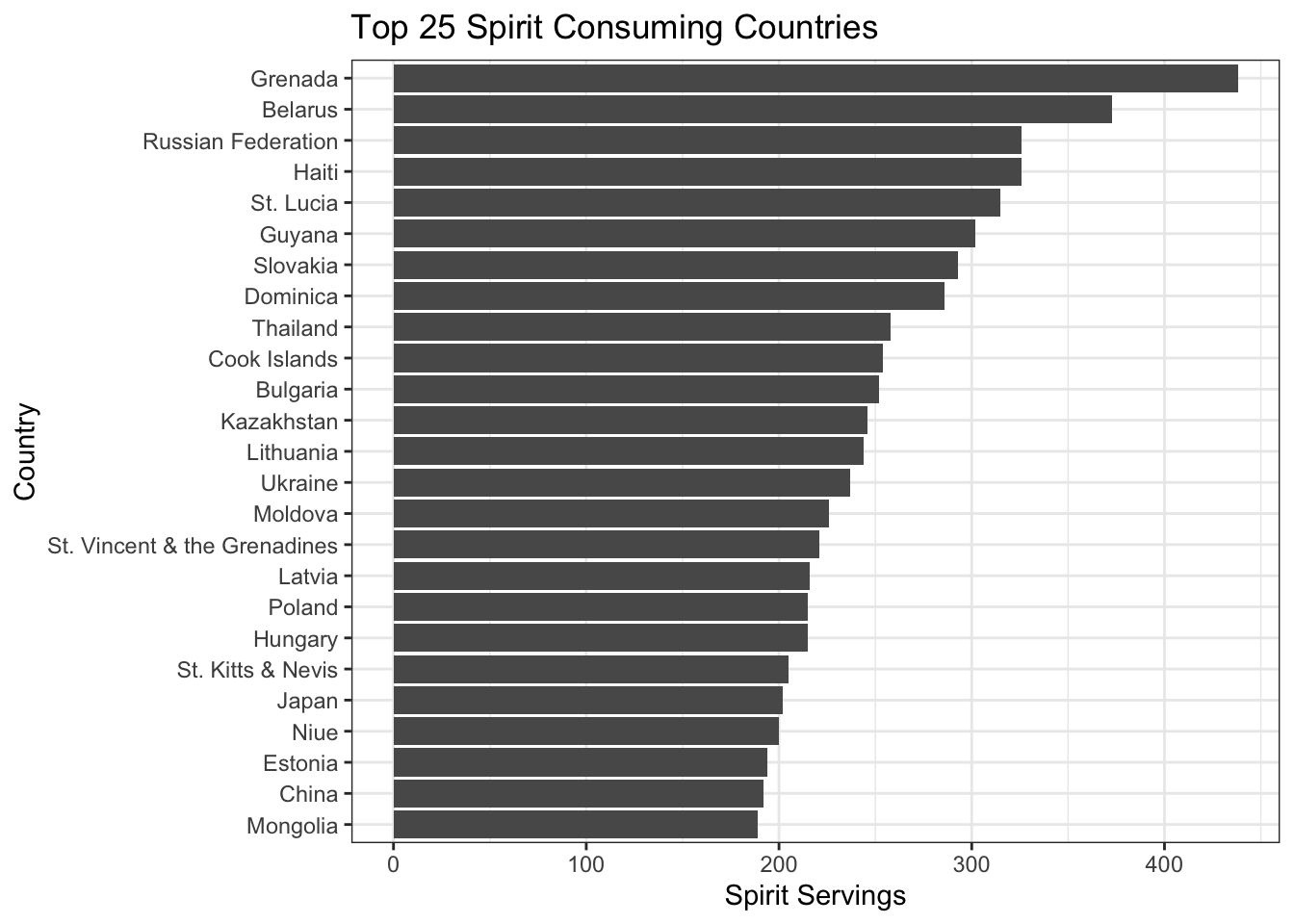
What can we infer from these plots?
The countries at the top of the list have high production of the given alcoholic beverage. Historic national connection to the given drink and national pride in its production seems to be an influencing factor in the choice of alcohol consumption. For example in Namibia the brewing industry is regarded as a source of national pride.